BMO Digital Banking Redesign
A platform redesign that rebuilt customer trust and introduced cross-sell to the authenticated experience for the first time.
Role: Lead Product Designer
Timeline: Dec 2023 - March 2025
BMO Digital Banking is the primary platform where millions of customers manage their accounts, transfer money, pay bills, and access financial services. The US platform needed a significant overhaul — not just to modernize, but to rebuild customer trust and unlock business growth opportunities that the legacy experience was actively blocking.
The redesigned account summary — the first page shipped and the foundation for the broader redesign
problem
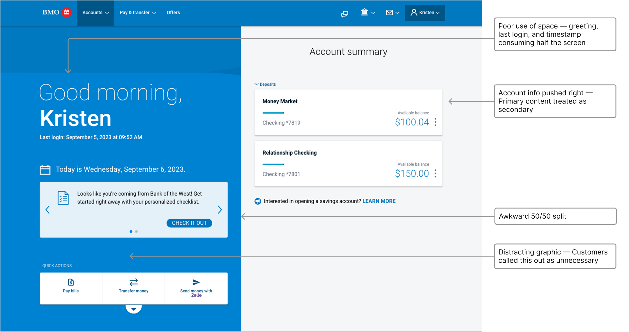
The account summary — the most visited screen in the platform — was working against the customers who relied on it. A 50/50 split layout dedicated half the screen to a greeting, a last login timestamp, a message announcing the day's date, and quick action buttons. The accounts themselves — the reason customers logged in — were pushed to the right side and treated as secondary in the visual hierarchy. A heavy blue background graphic pulled focus away from the banking content. Call center staff had been fielding the consequences for years: customers couldn't find what they needed, the experience felt outdated, and the platform was falling behind competitors. The team knew there was a problem. What we didn't yet know was the full shape of it.

The legacy account summary — half the screen given to low-value content, accounts pushed to the right, and a heavy graphic pulling focus from the banking experience
design approach
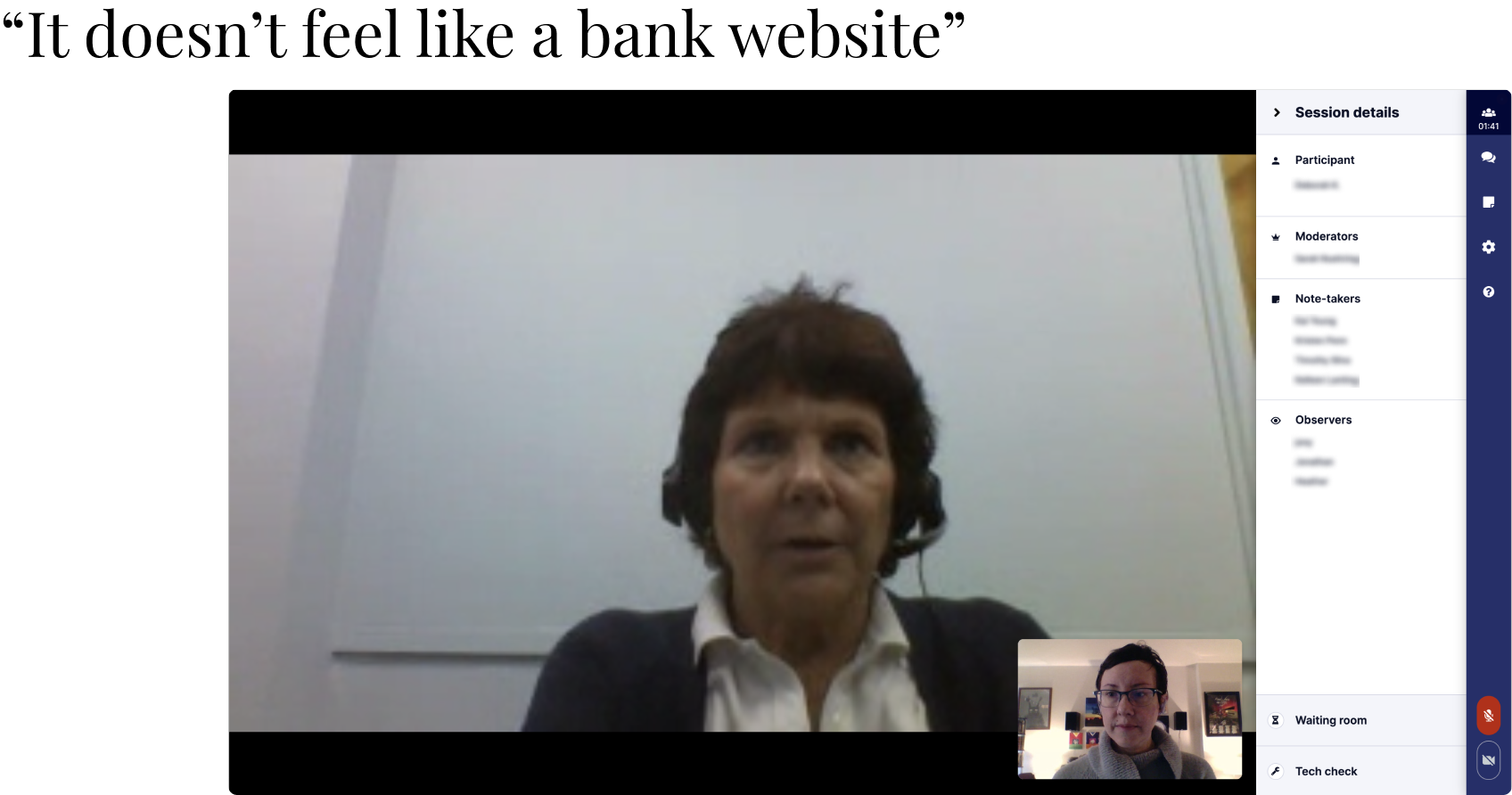
Phase 1 — Account summary redesign The initial brief was straightforward: fix the account summary page. Before designing anything, I partnered with a researcher to run a moderated usability study with 17 existing BMO customers, using screens from the production environment. We wanted to understand where customers struggled, what confused them, and what they were actually trying to accomplish. We also benchmarked NPS and CSAT, interviewed call center staff, and ran a competitive analysis.
Phase 1 research — moderated usability study with 17 participants

Component-level audit of existing UI patterns
The research confirmed what the call center had been hearing for years. Customers described the platform as outdated, hard to navigate, and unlike a modern banking product. One participant said it didn't feel like a bank website.
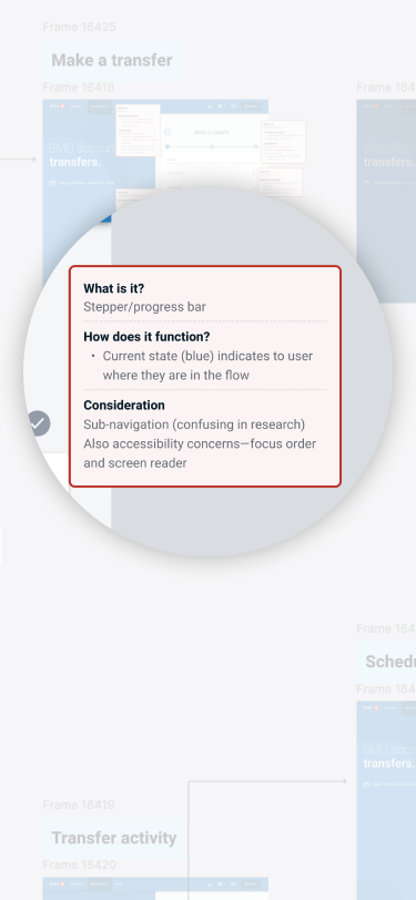
With the problem clearly defined, I explored three layout directions — a single column for simplicity, a content-first 70/30 split that prioritized account information, and an actions-first split that led with quick actions. I facilitated a working session with design, product, and engineering partners to align on direction. The 70/30 layout gave primary content dominant space while creating a structured secondary column for quick actions and contextual information. It was validated by research and defensible against pressure from our Canadian counterparts who advocated for pattern reuse across the two platforms. Our position was clear: the platforms had different codebases, different research findings, and no shared users — they didn't need to mirror each other.
We shipped the account summary redesign and saw measurable improvement in NPS and CSAT. The 70/30 layout became the foundation for the redesigned experience.
Layout explorations — single column, content-first, and actions-first
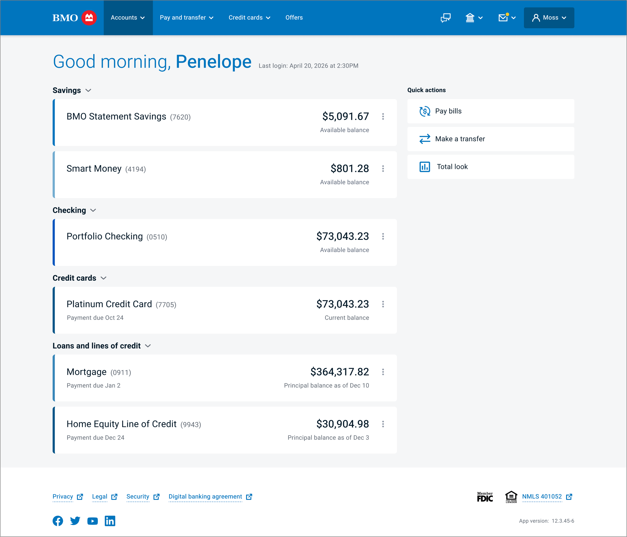
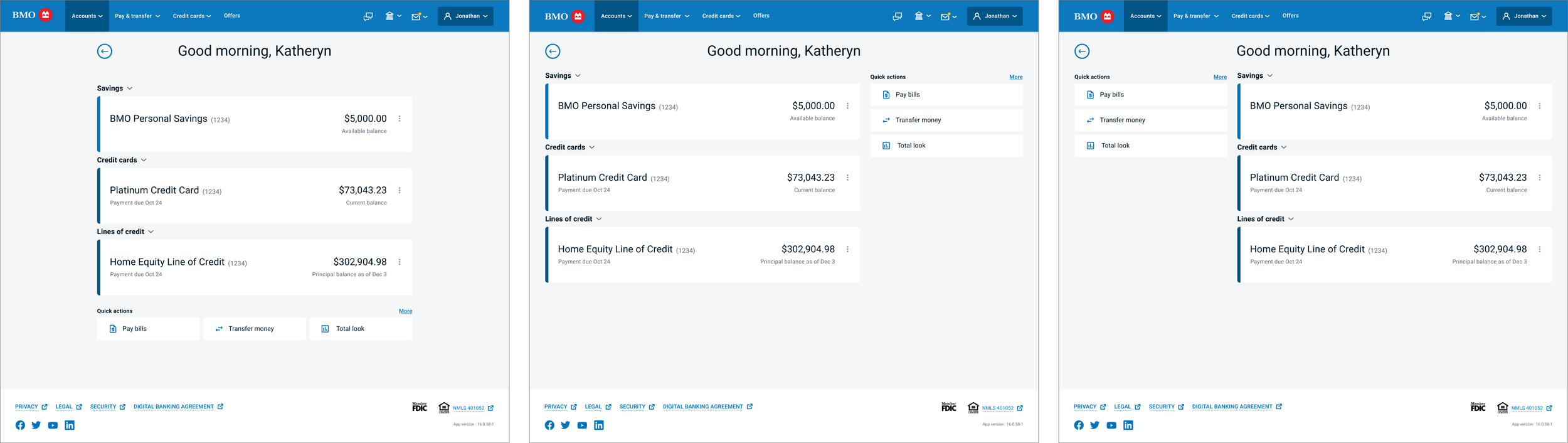
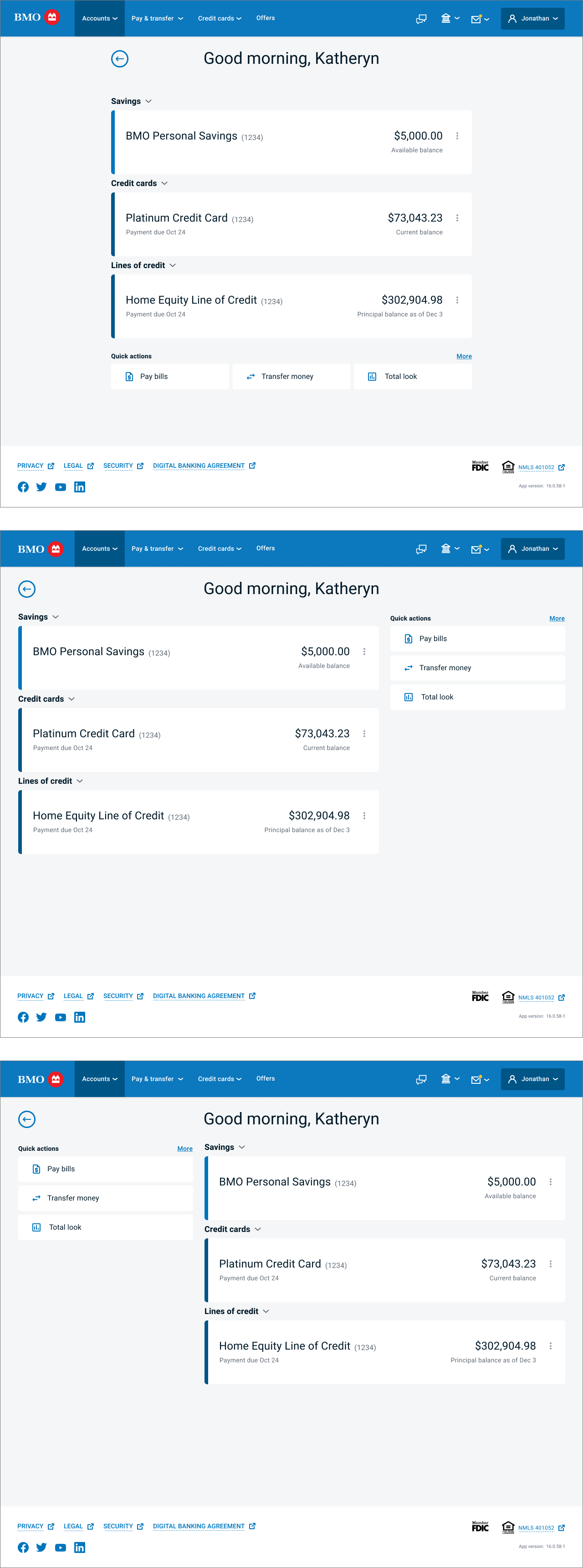
The redesigned account summary
Phase 2 — Expanded scope The account summary results earned expanded scope. The ask from product was straightforward: take what we did and apply it to the full authenticated experience. In addition, cross-sell was added to the brief. The competitive analysis I'd run in phase 1 confirmed what we already suspected — every competitor we looked at featured cross-sell within their authenticated experience. BMO was the outlier.
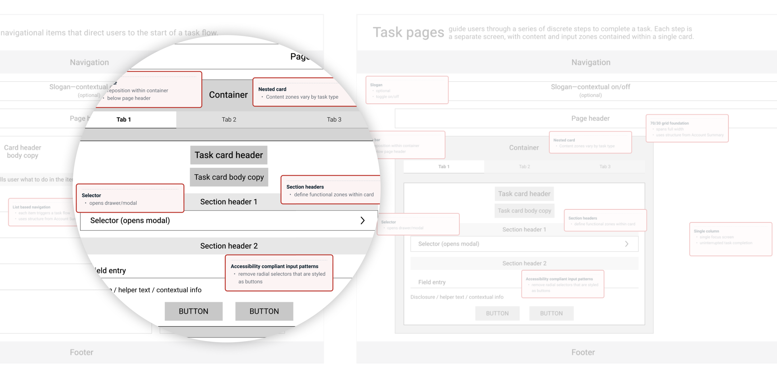
I knew from the work in phase 1 that scaling the redesign wasn't going to be as simple as the brief implied. The account summary was one page type. The full authenticated experience contained fundamentally different page types — hub pages, task flows, system feedback screens — each with different structural requirements and component relationships. Applying the account summary template wholesale would have produced an inconsistent experience and created technical debt downstream.
So before designing anything, I went back and ran a full site audit. I catalogued page types across the entire authenticated experience, identified the components that lived on each, and built a structural framework that mapped the full scope of what "redesigning the authenticated experience" actually meant. That work reframed the conversation with product — this wasn't a reskin or a pattern copy-paste. It was a larger undertaking that required its own design logic.
The framework also helped us sequence the work. We aligned on starting with the product pages, designing and building those end to end, and treating the remaining page types as a subsequent phase.
Navigating cross-sell resistance happened in parallel. Partners worried about cluttering the experience. I kept introducing designs with cross-sell placements framed as explorations — "just to see if it works" — rather than pushing for commitment upfront. Continued exposure to the designs, combined with research showing users were largely indifferent to contextual cross-sell, gradually shifted the conversation.
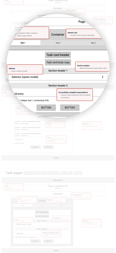
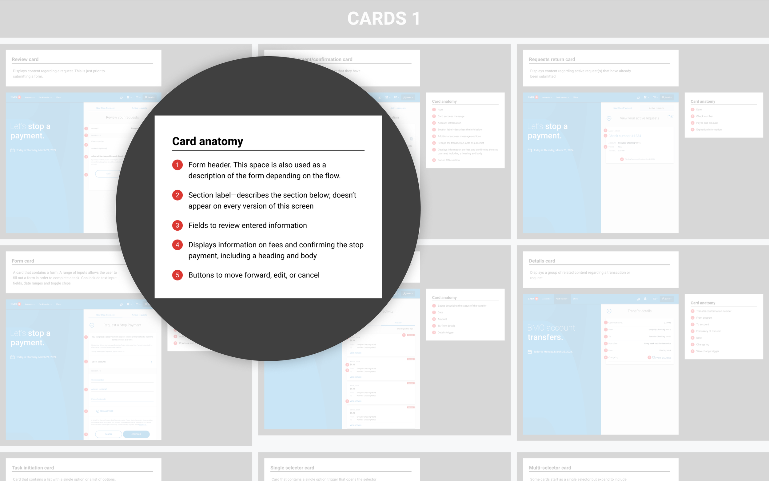
Page type framework — structural templates for hub, task flow, and system feedback pages
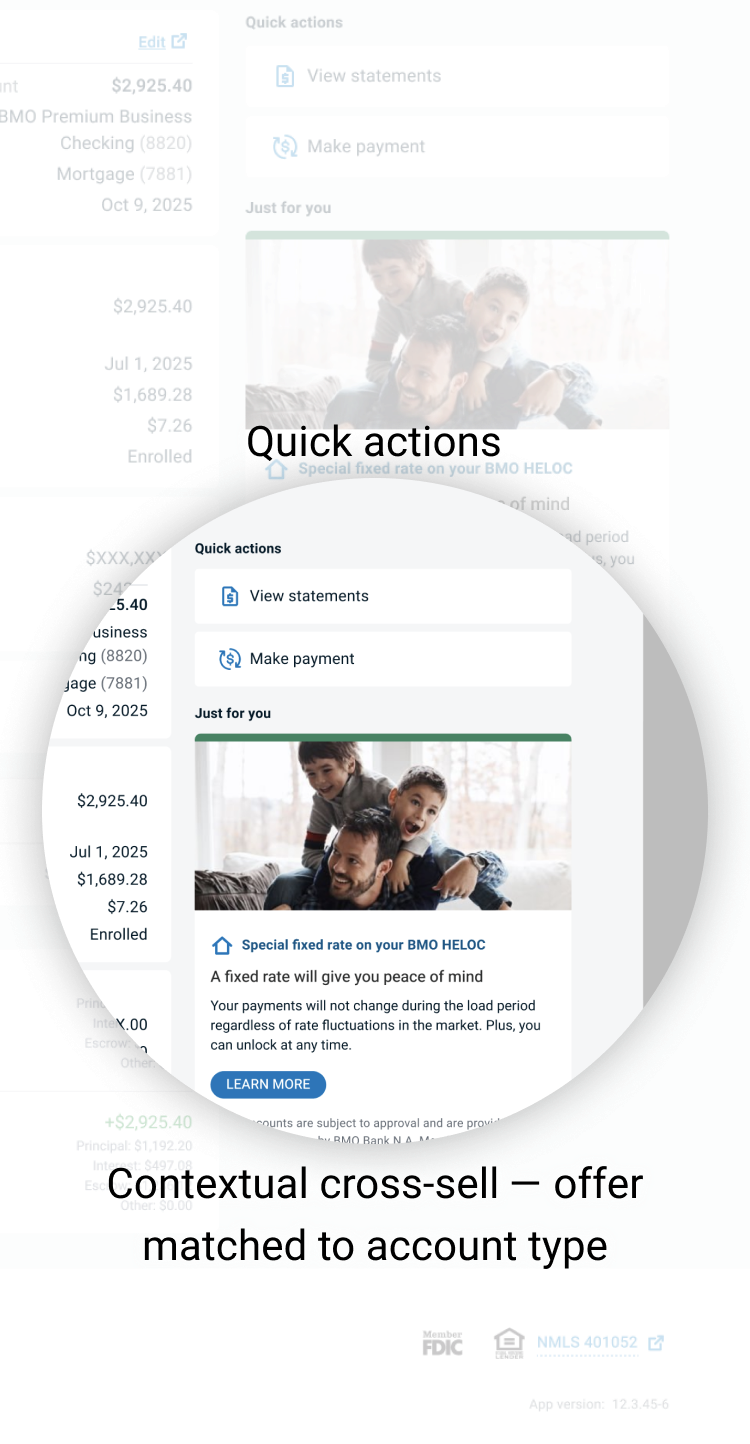
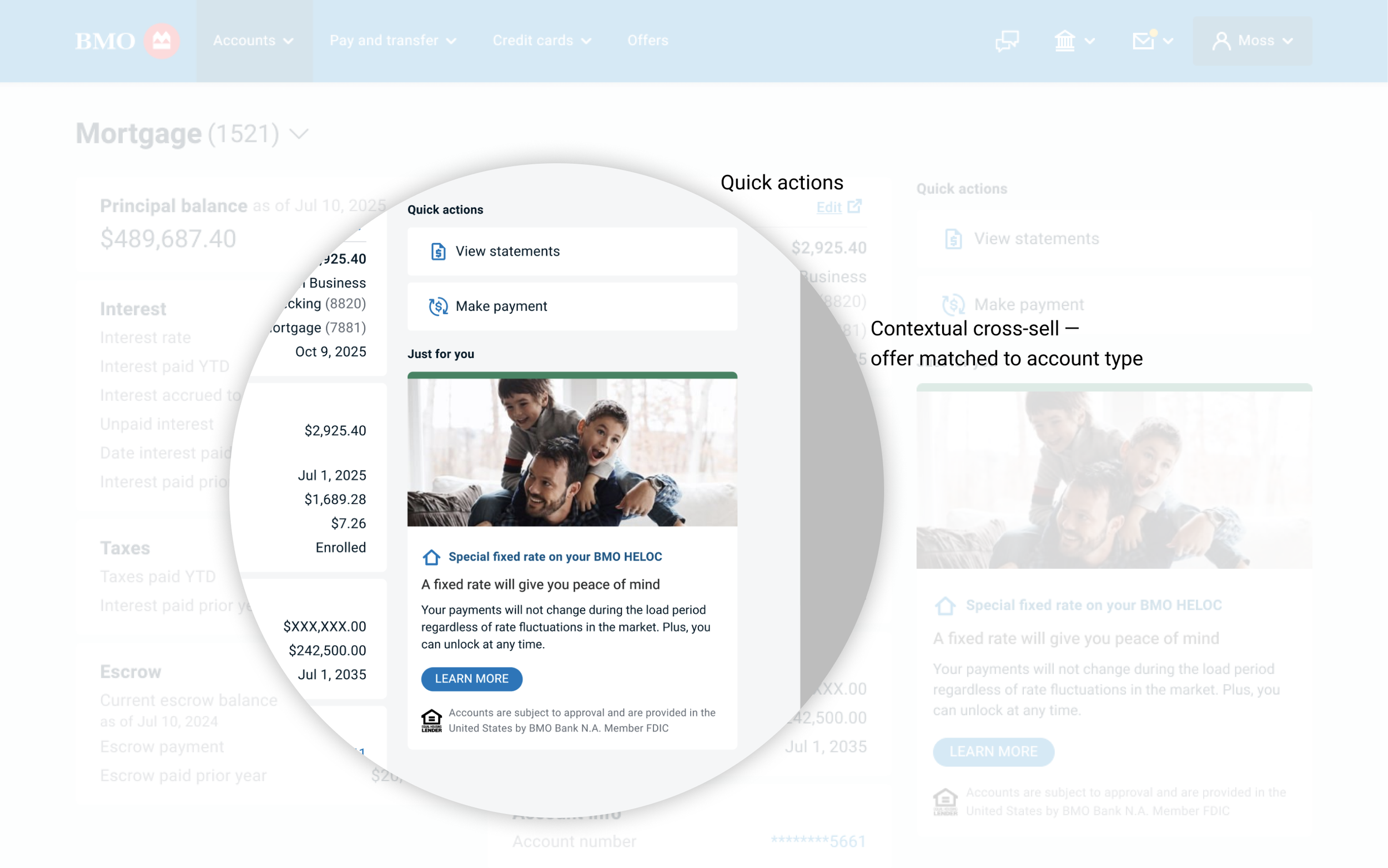
Mortgage account detail — contextual cross-sell in the right column
solution summary
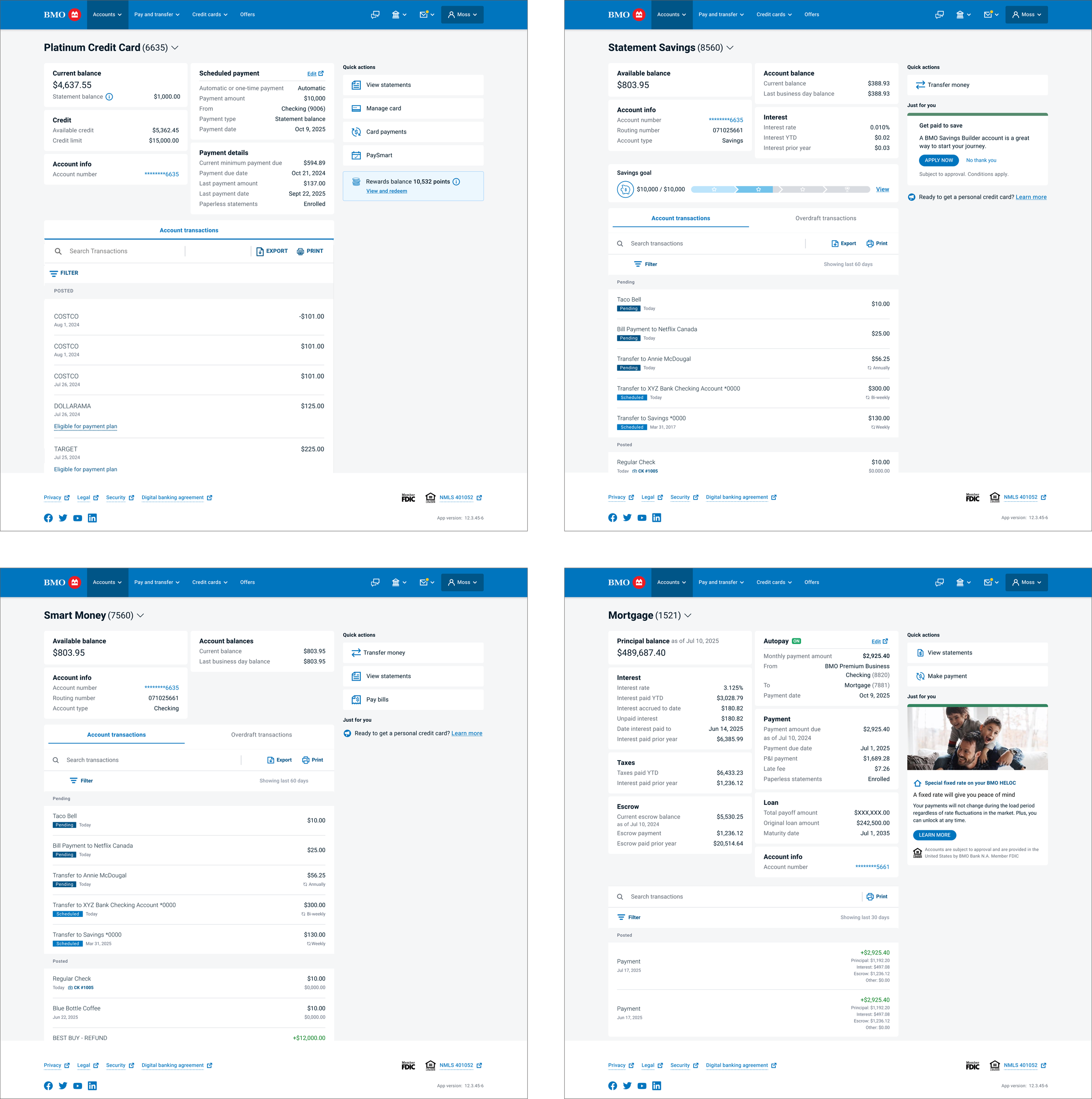
The redesign replaced a fragmented, trust-eroding experience with one that felt coherent, modern, and easy to navigate. A 70/30 layout — validated by users as familiar and trustworthy — became the structural foundation, replacing the legacy 50/50 split that had buried critical information for years. The collapsible "show more" pattern that frustrated customers gave way to a card-based information system that made account details visible and scannable across the majority of product types.
Cross-sell appeared within the authenticated experience for the first time. Placement was validated through competitive analysis and user research, and designed to feel contextual rather than interruptive — which is ultimately what brought skeptical partners on board.
Underlying all of it was a template framework that gave the team a shared design language to work from. It created consistency across the authenticated experience while accommodating the structural differences between product types — and reduced the guesswork that had previously slowed development.
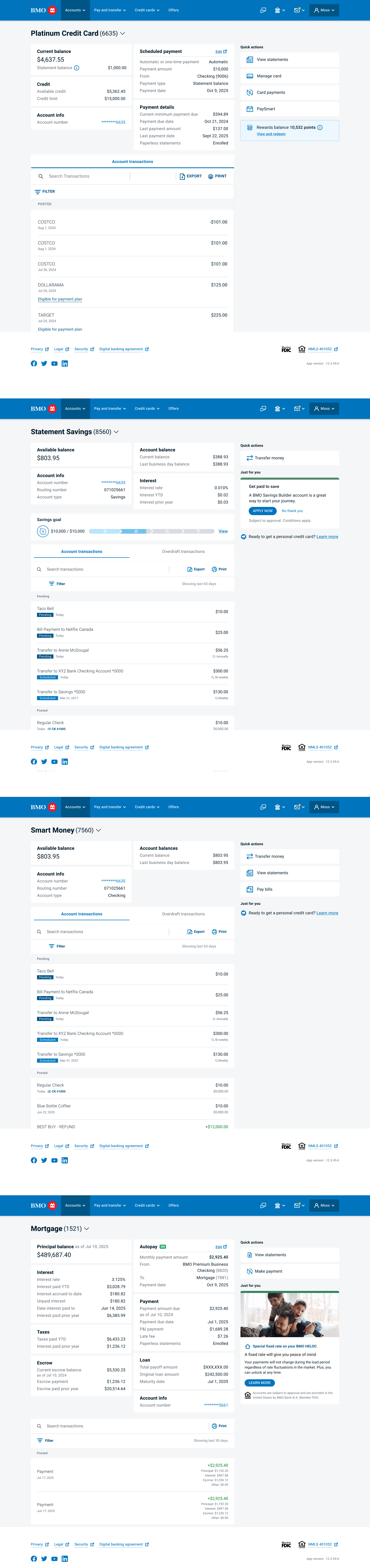
Shipped product pages — credit card, savings, checking, and mortgage
impact
NPS increased by 12 points and CSAT improved from 3.4 to 4.0 — measured before and after the account summary launch, giving us a clean signal that the redesign was working. Post-launch interviews reinforced the numbers: customers described the updated experience as clearer, easier to navigate, and more trustworthy. Cross-sell capabilities launched within the authenticated experience for the first time, driving a significant increase in traffic to product landing pages within the first 30 days. The template framework reduced development load for new features and established design patterns now used across BMO's digital products.
reflection
This project taught me that the most important design work is often the work that happens before any design work. The audit, the page type framework, the scope reframing — none of that produced a single shipped screen, but it shaped everything that did ship. I came away with a much stronger conviction that investing in structural thinking early is how you protect quality at scale.
The cross-sell story was a lesson in change management as much as design. Pushing for commitment upfront would have created resistance. Sustained exposure to good work, backed by research, was more effective than any argument I could have made in a meeting. I'd apply that approach earlier and more deliberately on future projects.
The work ended before the framework could be fully realized. The product pages shipped, but the hub pages, task flows, and system feedback screens were scoped for a subsequent phase that didn't happen. That's an uncomfortable place to leave a project. What I can say is that the foundation is solid — the page type framework exists, the design language is established, and the patterns are documented. The work is interruptible, not incomplete.
if you’re a hiring manager, contact me directly for the full case study.