Mobile Wealth Management Access

A first-of-its-kind mobile wealth experience built within the constraints of an existing retail banking app.
Role: Sole Designer/IC Lead
Timeline: January 2021 - March 2023
Bank of the West's wealth clients had no mobile access to their investment accounts — a gap that had persisted through multiple failed attempts to solve it. This initiative brought wealth management into the bank's existing mobile app for the first time.
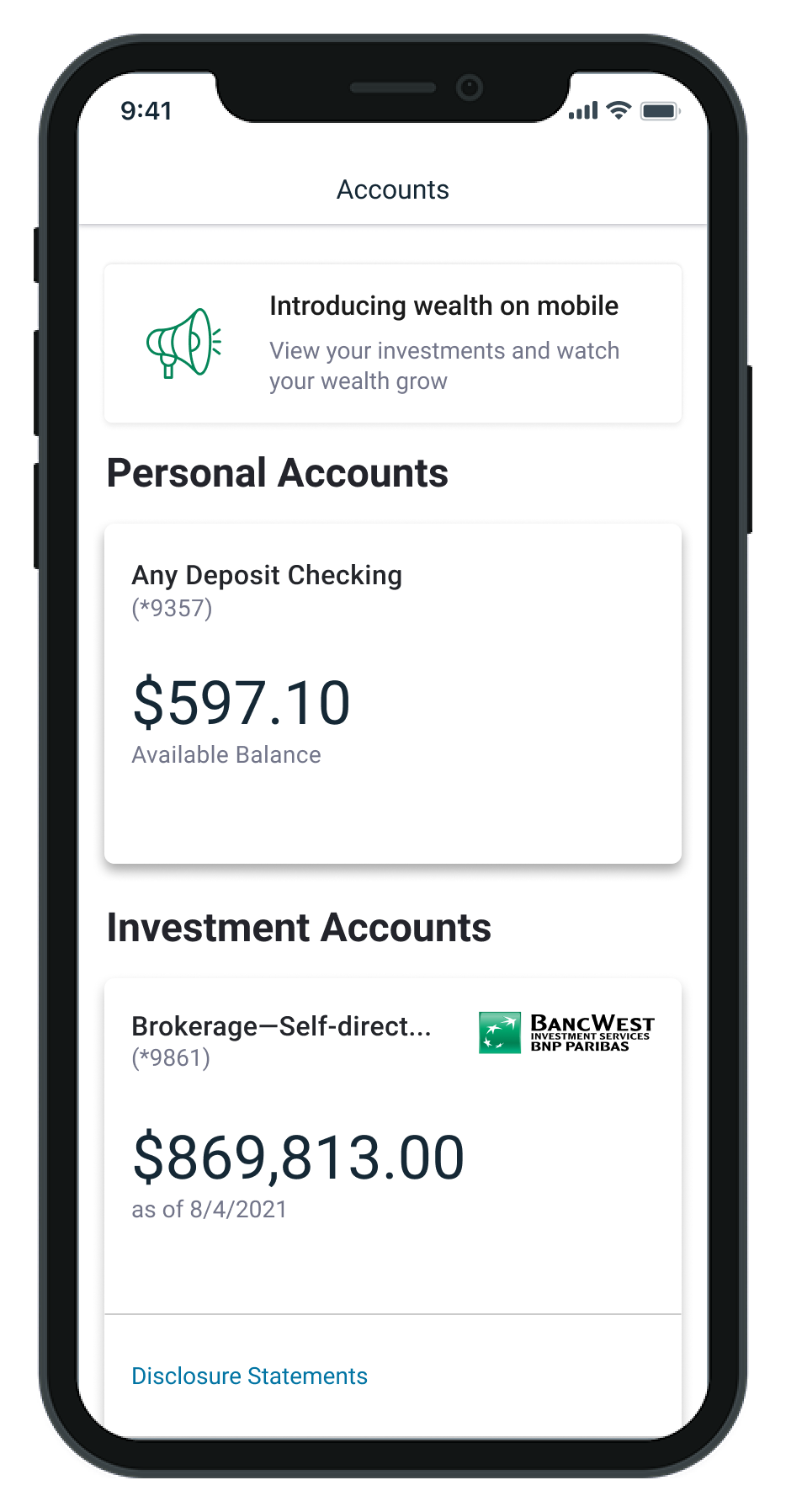
The account summary screen at launch — the first time wealth clients could access their investment accounts on mobile
problem
Wealth clients had zero mobile access to their investment accounts — forcing them to call advisors for basic information like balances and holdings. Behind the scenes, wealth products lived across multiple desktop-only platforms from different vendors, creating a fragmented experience for clients and an inefficient one for advisors who fielded routine requests instead of focusing on high-value work. Competitors were already offering mobile wealth access. Bank of the West was falling behind.
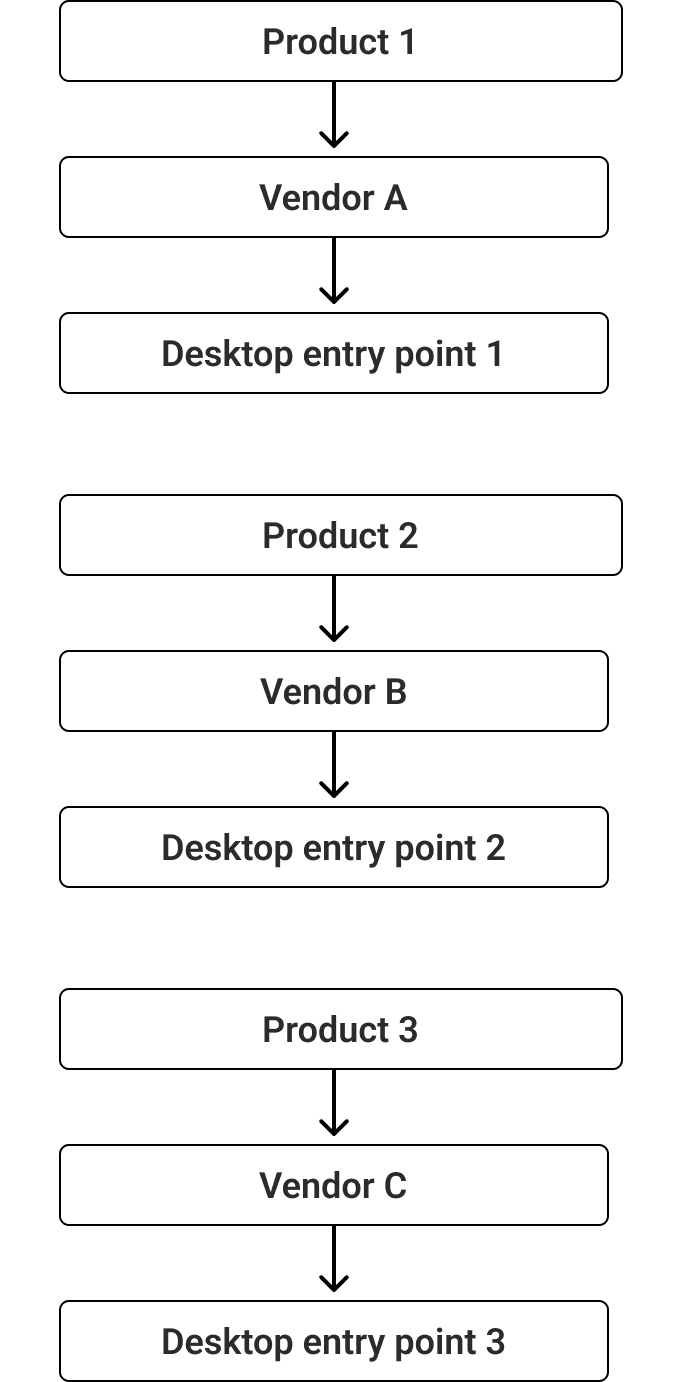
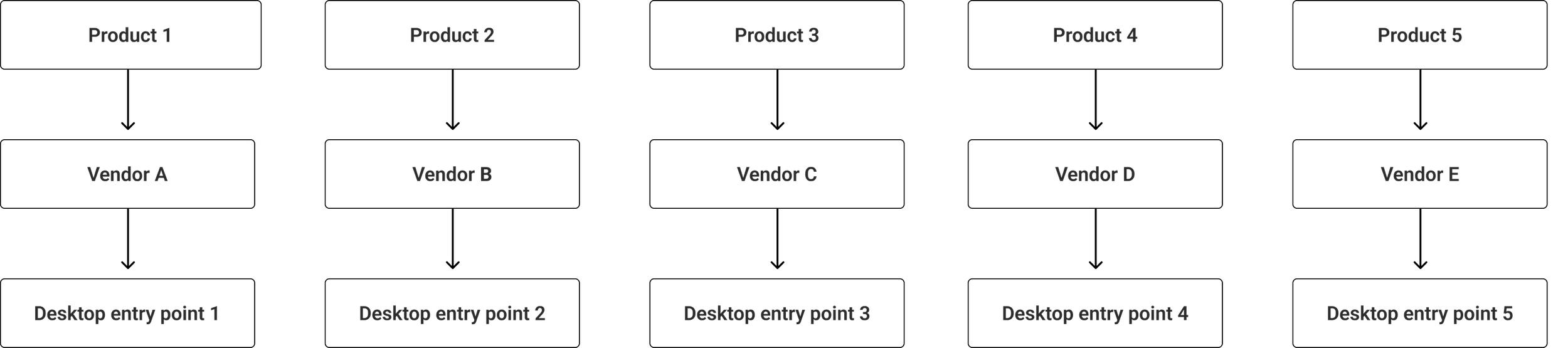
Multiple products, multiple vendors, multiple desktop-only entry points — no unified experience, no mobile access
Design approach
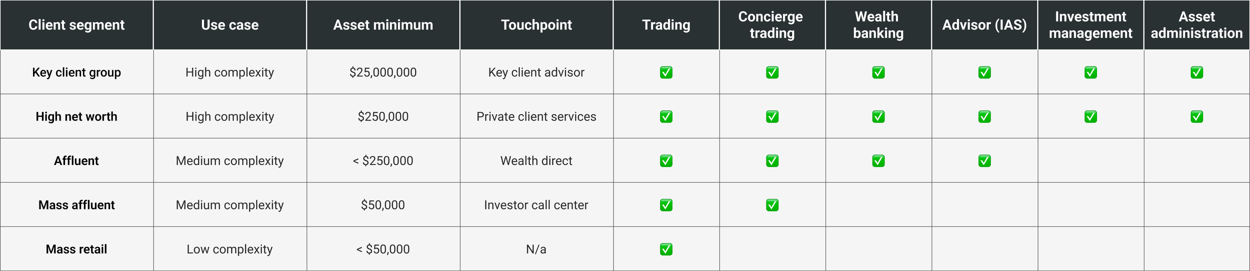
Wealth management at Bank of the West spanned multiple client tiers, each with different asset levels, service models, and digital needs. Before designing anything, I mapped these segments to understand scope and prioritize where to start. Rather than designing for the most complex client first, I made a deliberate decision to begin with the lowest-complexity segment — clients with under $50K in assets and no relationship manager. They represented the largest portion of the client base and the most tractable design challenge, allowing me to ship something real while establishing patterns that could scale to more complex tiers over time.
This scoping decision shaped everything that followed: which data to surface, which navigation patterns to prioritize, and where to draw the line on v1 features.
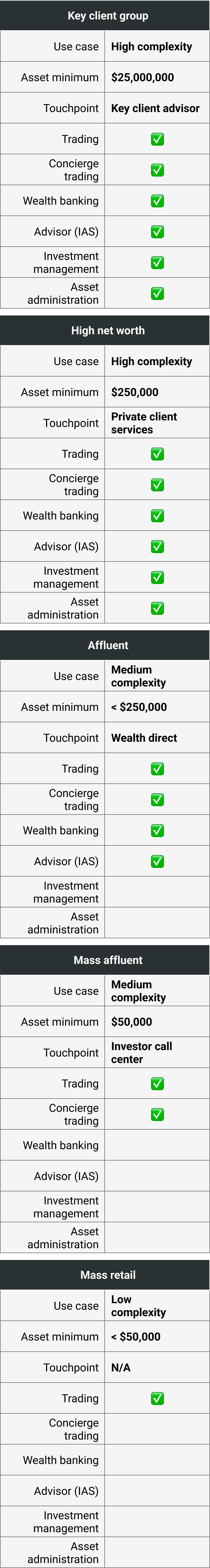
Client segmentation framework — five tiers mapped by asset level, service model, and digital touchpoint
The language gap Internal product naming — designations like "Self-directed JTTN" and "Transfer on Death" — meant nothing to our clients. Usability testing revealed that they consistently referred to everything as their "investment accounts" and couldn't identify accounts by the names we intended to launch with. I pushed to simplify, partnering with a content designer to revise section labels and product names to match how clients actually talked about their money. The data was the shield — I kept returning to what clients said in testing to hold the position against line-of-business partners attached to internal nomenclature.
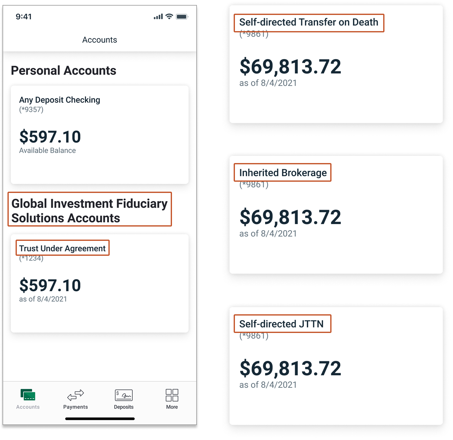
Account names as they appeared in testing — clients consistently failed to recognize their own accounts by these designations
The compliance standstill Simplifying the language immediately triggered a compliance requirement: investment accounts had to carry formal BWIS designation. The project reached a genuine standstill — compliance wouldn't move even with UX impact evidence. The solution came from an observation: an existing pattern elsewhere in the app used a partner logo on an account card in place of a text label. I proposed the same approach using the BWIS logo. Compliance accepted it with minor size and placement revisions. A regulatory constraint solved with a design pattern, not more words.
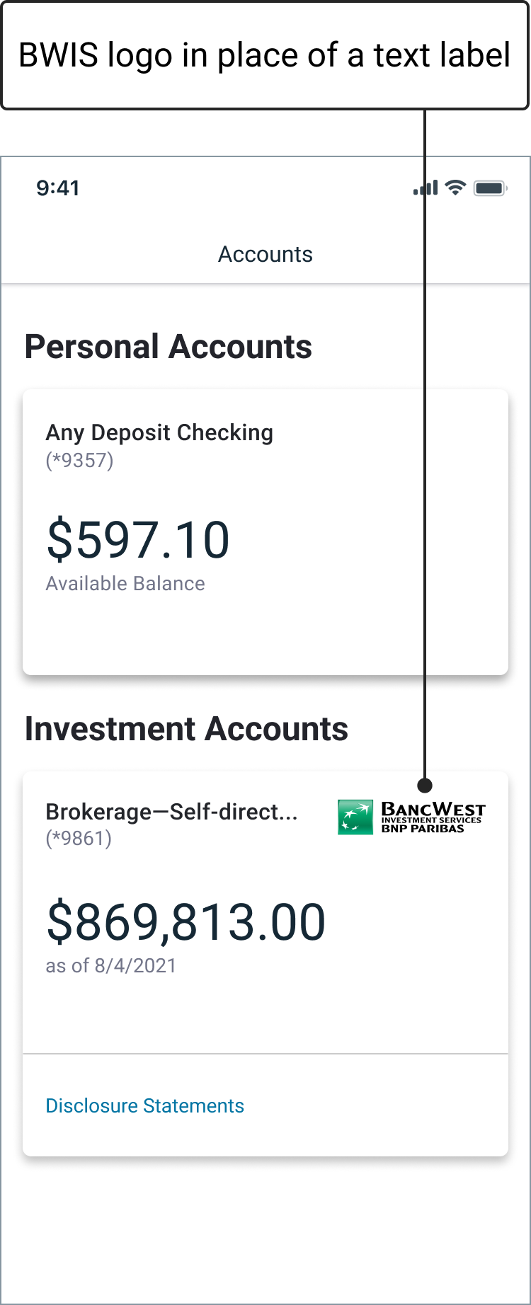
Compliance required formal BWIS designation on investment accounts — a logo solved what a text label would have complicated
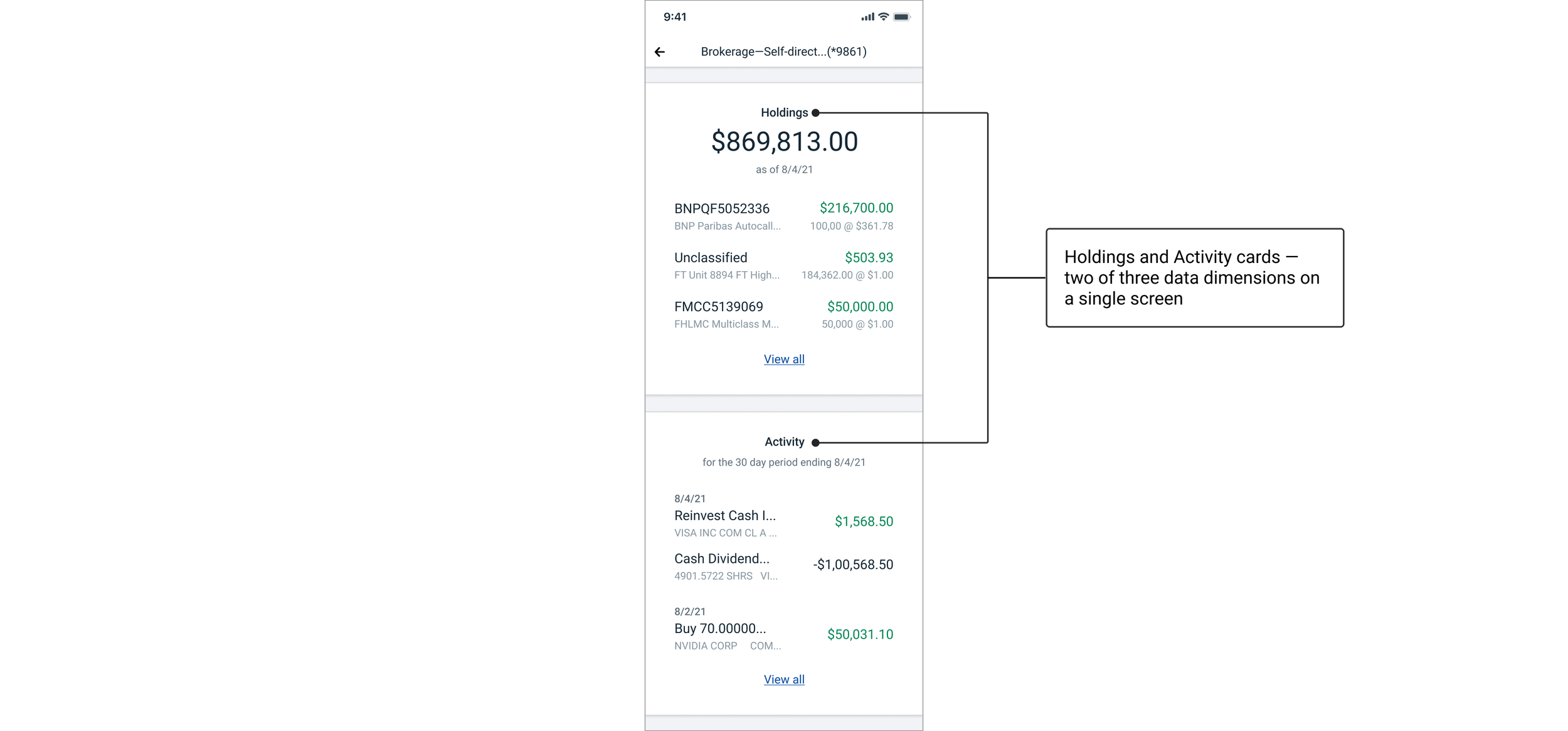
Navigation without a precedent The third challenge was one the app had never needed to solve before. Retail accounts have one dimension of data — a single transaction list. Wealth accounts have many more, but for the first release I scoped navigation to the three most essential: holdings, performance, and activity. I had to design in-account navigation that felt native to the existing experience without requiring new infrastructure. After exploring tabs, dropdowns, and embedded navigation options, I landed on a card-based layout that surfaced all three data dimensions on a single screen. Equal hierarchy, no default, better performance, and a pattern the design team adopted elsewhere in the app.
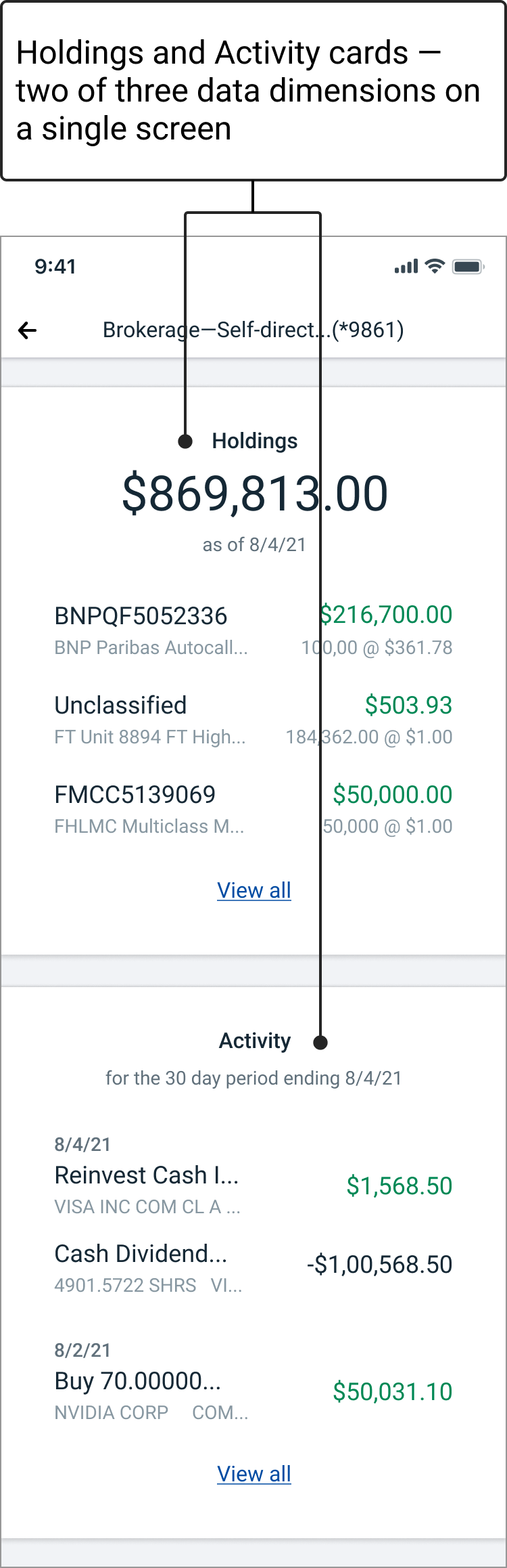
Card-based layout surfaces all data dimensions simultaneously — equal hierarchy, no default, and better performance than tab-based navigation
Compliance without compromise When deposit and non-deposit accounts share a screen, regulatory requirements meant extensive disclosure text on every relevant screen. I mocked it up as requested to show due diligence. It was bad. I brought design leadership into alignment and proposed a linked disclosure hub — a lightweight pattern that satisfied the requirement, preserved the experience, and created a reusable solution for future needs. It tested well and became a scalable system pattern.
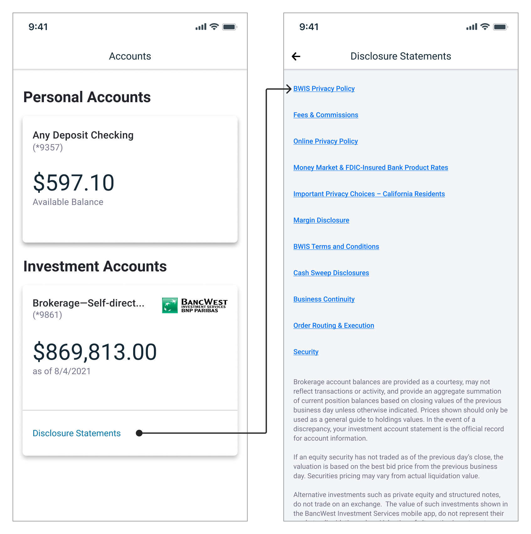
A linked disclosure hub replaced inline disclosure text — satisfying the regulatory requirement without disrupting the experience
solution summary
As sole designer and IC lead, I integrated wealth management into the bank's existing retail mobile app — an app whose architecture was built for deposit accounts, not the multi-dimensional data wealth accounts require. I established a client segmentation framework to scope the MVP, adapted existing UI patterns to handle holdings, performance, and activity data, and navigated compliance, content strategy, and UX architecture challenges. The result: a unified card-based account system with self-service access to wealth data and a scalable disclosure pattern that satisfied regulatory requirements without degrading the experience.
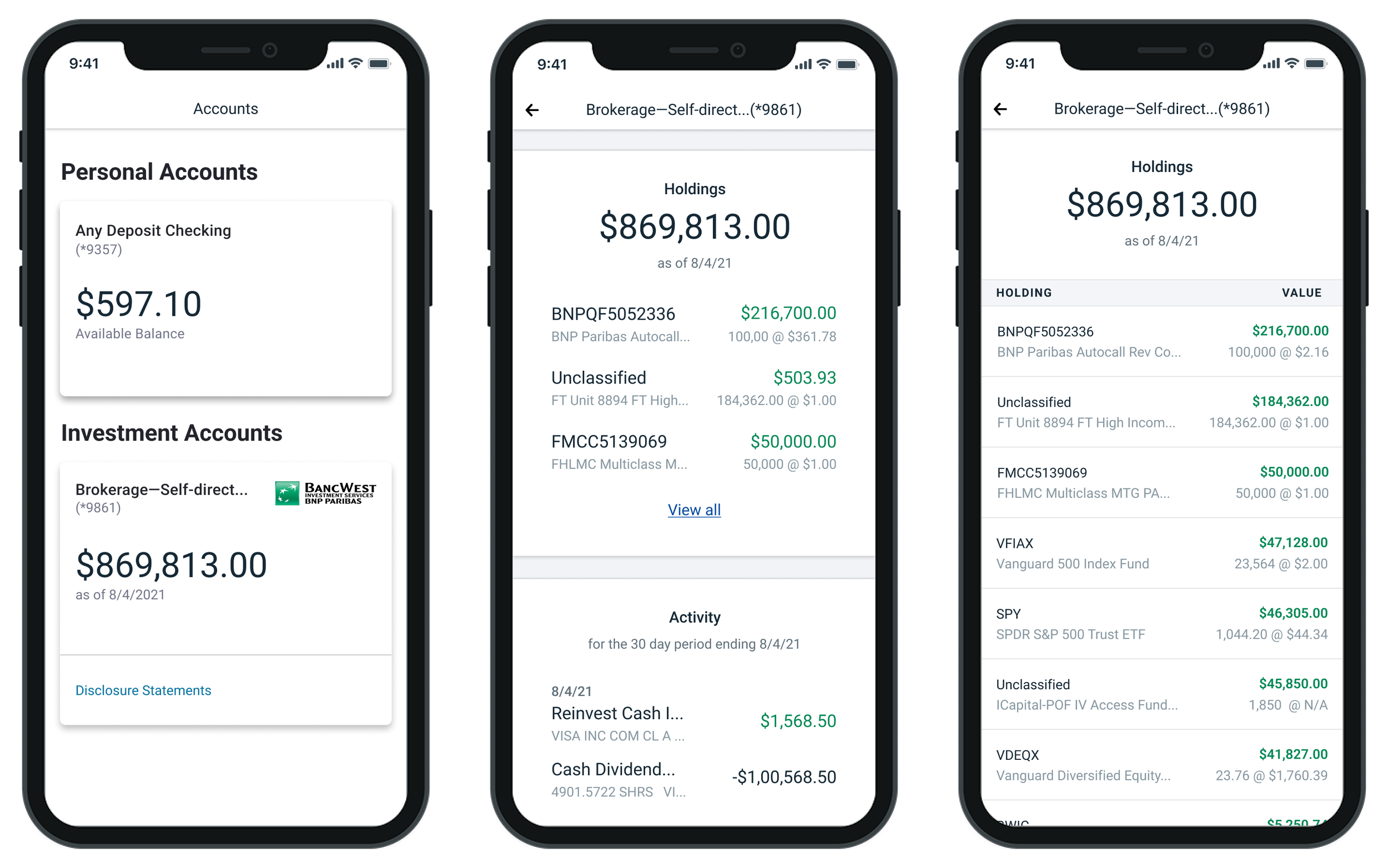
The shipped product — personal and investment accounts unified in a single authenticated experience
impact
Brought mobile account access from 0% to 100% of eligible wealth clients — the first time the initiative had successfully shipped after multiple previous attempts. Reduced routine inquiries to the investor call center by giving low-complexity clients direct self-service access to their account data for the first time. Established reusable patterns — including a scalable disclosure system and card-based navigation — adopted across other areas of the app, and restored the bank's competitive footing in digital wealth management.
reflection
This project taught me that compliance partners and line-of-business stakeholders aren't obstacles — they're constraints that sharpen the work if you engage them early enough. My PM knew to bring them in from the start, and watching how that changed the dynamic taught me something I couldn't have learned any other way. Every piece of feedback I disagreed with still informed the project in ways I didn't anticipate. I'd bring that instinct into every project now, not just the complex ones.
The language problem was the most unexpected lesson. I came into this project thinking about navigation, data architecture, and UI patterns. What the testing revealed was that none of that mattered if clients couldn't recognize their own accounts. Content strategy and UX are inseparable — you can't design the experience without designing the language simultaneously. I didn't have a content designer at the start of this project and I felt that absence acutely. I'd advocate for that resource from day one on any project of this scope.
The platform was sunsetted when Bank of the West was acquired by BMO. That's an uncomfortable thing to sit with — work you're proud of that didn't survive the business decision that followed it. What I've come to is this: the work shipped, it was in market, it served clients, and it moved the metrics it was supposed to move. A corporate acquisition is outside the scope of what design can control. The account summary screen survived. The patterns were documented. The work was real.
if you’re a hiring manager, contact me directly for the full case study.